Ground contact time is speed-dependent. Here is how to normalize it.
Ground contact time shows up in the running dynamics data of most modern GPS watches. It measures how long your foot is in contact with the ground during each step. Lower is generally considered better, a sign of a stiffer, more efficient stride.
The problem is that raw GCT numbers are not directly comparable across runs at different paces. A tempo run will always show lower GCT than an easy recovery jog, not because your running form improved between Tuesday and Thursday, but because GCT is physically dependent on speed.
Comparing raw GCT values across runs at different paces is about as useful as comparing average heart rate without accounting for effort level.
The physics: faster pace, shorter contact
At higher speeds, flight time increases. You spend more time in the air between steps. Since GCT is the contact portion of each stride cycle, and the cycle gets shorter at higher speeds, GCT drops as a direct consequence of going faster.
This means any meaningful comparison of ground contact time across sessions needs to account for the speed at which each measurement was taken. A raw GCT of 240ms at 5:00/km pace and 260ms at 7:30/km pace do not tell you what they appear to tell you without normalization.
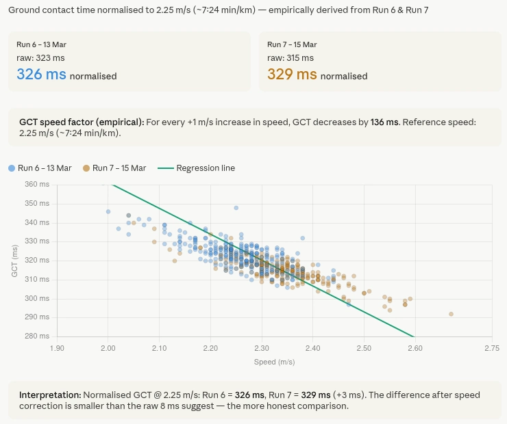
Fitting a regression to my own runs
I asked Claude to look at the ground contact time data across several of my recent runs via the Tredict MCP Server. It fetched the full time series for each activity, meaning second-by-second GCT and speed data, not just session averages.
From that data it derived the relationship between GCT and speed empirically, using my own runs rather than a generic model. It fitted a linear regression through the data points, which gave a speed-GCT factor calibrated specifically to my stride.
Using that factor it calculated a normalized GCT value, which it called nGCT, referenced to a fixed speed of 2.25 m/s, roughly 7:24 per kilometre, which corresponds to my typical easy run pace. Every session's GCT values were then adjusted to what they would have been at that reference speed, making them directly comparable regardless of the actual pace of the run.
The result was less dramatic than the raw numbers suggested
The honest result was that the difference between two runs I had been comparing was smaller than the raw numbers suggested. One run appeared significantly more efficient on raw GCT. After normalization, the difference was still there but much less dramatic. The raw numbers had been influenced by the pace difference between the two sessions.
That is the point of the exercise. Not to make the numbers look better or worse, but to make them mean something.
The caveat is pace range, not data volume
Claude was clear about where this analysis was limited, and it is worth being precise about what the limitation actually is. It is not the amount of data. Claude can see my full training history through the MCP Server, every run I have ever recorded, second by second.
The constraint is the spread of paces inside whichever slice of history you point it at. A regression between speed and ground contact time only learns as much as the variance in the input allows. If the runs all cluster around the same easy pace, the factor is fitted on a narrow band and extrapolation outside that band is unreliable.
To see whether that held up in practice, I asked Claude to repeat the analysis across my January to April 2023 Hamburg Marathon block. That period had real variance: easy runs, tempo sessions, faster intervals and the marathon itself. Claude pulled out a handful of standout activities at different paces, calculated nGCT for each one and rendered a small chart comparing them. With a pace range that wide, the regression had something to fit on, and the numbers were meaningful rather than approximate.
So the fix is pace variance, not dataset size. Either you build it into your current training, or you point Claude at a past block that already had it.
Most platforms hand you a number and walk away
Most running platforms show you raw GCT and leave interpretation to you. The number goes down, you assume your form improved. The number goes up, you worry. Neither conclusion is necessarily correct without accounting for pace.
Having Claude pull the time series data from Tredict and calculate a speed-normalized value in the chat, based on my own data rather than a generic formula, is a different kind of analysis than what training apps typically offer.
It is also a good example of what becomes possible when an AI assistant has access to actual time series data rather than just summary metrics. The normalization only works because Claude could see every data point from every run, not just the session averages.
The activity time series data Claude used here comes through the Tredict MCP Server. The technical article on this site explains what data Claude can access and how. The previous article looks at a different side of the same MCP Server, the interactive widgets that render Tredict UI directly inside Claude and ChatGPT. The next article looks at Perplexity as an MCP client, using its Custom Connector to analyse training data with real-time web context.